Thursday, September 11, 2008

Report on first test of ArtRage

I purchased the Artrage program from Ambient. There's a free download, but it's missing some stuff--but still does a lot--there's a $25 download. I got the $39 version that comes with a CD and an 80-page manual.

I had terrible insomnia last night, which gave me an opportunity to play with my new toy. I had thought it was a plug-in for photoshop (and I sort of wish it were! then you could use it in combination with other photoshop effects etc)--I thought that's what I'd read, but I'd misremembered, I guess (I read a review in the Photoshop users Journal). It is not, or, if you can do that, I haven't figured out how. It's its own fully functional program.

My first attempt, the red hibiscus, did not turn out all that well. Either did my second, the rose (recognize that rose?) I think the third is a little better--I did that this morning. The last picture
is the original of the fruit bowl still life.

You can load a picture, and then load another layer (yes, there are layers), and put a tracing version of it and paint into that layer and it makes it look like a painting. The oil paint is very realistic, as are the markers and pencils. More realistic (or closer to real paints and markers etc) than the photshop tools.

However, there are no shortcuts,a t least none I have discovered. Every paint stroke you have to make yourself. It took me a while just to begin to get the hang of it. You can change brush size and paint type and the way the paint responds. I just discovered that there is a slider for something I didn't realize had a slider. But so far, I haven't figured out any way to change the brush size other than typing in a percentage number, kind of a pain. But there is so much, that it
will take a while to figure out.

The palettes are in the corner and move out of the way when yr painting. Which is nice.

So far, I have to say, this program is not for the faint of heart. And my results are not that great for a lot of effort. But there are always learning curves. I will report back as I experiment.

You may have seen the red hibiscus before--I did a smudge painting of it on photoshop which came out MUCH better. However, when I did that last night, I hadn't yet learned how to change bush sizes or proper layering of the images I was attempting to paint.

You can also paint from scratch. I did one of those too, but deleted it. But I could see possibilities in it! These three are from photos.

I am not sure if there is any way to import the images into photoshop--that would be ideal What I did is save them as jpgs and then open those in PS. But the smudge brush in PS does NOT combine well with the AR brushes.

I recommend if you're interested you try the FREE DOWNLOAD first, see what you think. I recommend that if you decide to try it, get the image PERFECT in photshop first (as close as possible as to how you want the painting to look). Then load the image in the bottom layer, add a new layer, put the tracing image (same image) in the second layer and be sure the palette is set to paint from image colors. You can add other colors later. Just be aware the process is fairly time consuming, so don't start until you have a little free time.

Click on the images to view larger. Note the two black spots in the bottom corners of the still life with fruit. That's where I attempted to click on the palettes and missed. There is an undo function under edit in the drop-down menu.

Thursday, January 31, 2008

New Challenge: A hint of red

The challenge for the month of January for Seeing 101 is: a hint of red, or a taste of red. While I want to leave it mainly to your imagination, the idea of this challenge is to find or insert red in something mostly not red. And to gain in the process. You can submit any time in the month of January, or beyond that, using the subject line: "Hint of Red" or "Taste of Red". Art and photos are both accepted, as well as photoart.

Saturday, January 26, 2008

Spot the Red

A VERY SMALL HINT OF RED
Reflections on a fishing pond.

A Touch of Red: Footbridge Over Nashua Creek, Belle Isle

A Touch of Red: Footbridge Over Nashua Creek, Belle Isle, by Mary Stebbins Taitt. This was also an exercise in Selective Color and I am not sure it turned out as well as I'd hoped. The original picture was fairly colorless anyway, taken as it was during the winter. Click image to view larger.

A Hint of Red, Orchid

A Hint of Red, Orchid, by Keith Taitt

A Hint of Red: Sea Gull

A Hint of Red: Sea Gull, by Mary Stebbins Taitt

A Touch of Red: October Wind SP

A Touch of Red: October Wind SP, by Mary Stebbins Taitt. A digitally
altered photograph.

Sunday, August 13, 2006

Fonts


Here is a great site for fonts if you are interested.
 
 
Robin

Sunday, July 16, 2006

July 15 Theme/Challenge: Simplicity and Complexity

This challenge is for both photographers and artists. The idea is to explore simplicty and complexity. When is simple good and when is it too dull or boring? When is complexity good, and when is it too "busy" or "fussy"?

Post your pictures to July 15 (for intakes). Outtakes can be posted on the 14th or 16th. Use the post and comment options on the lower left of the posting window to adjust the date. You can post on the designated date or before OR anytime afterwards, as long as you change the date so that it fits in the time span of this theme/challenge.

Email me at taittems@gmail.com if you need an invitation to join the blog.

You may say anything reasonable about your own or other's photos, and, please, at some point in your comments, address the issue of simplicity and complexity in photos and/or art.

Saturday, July 15, 2006

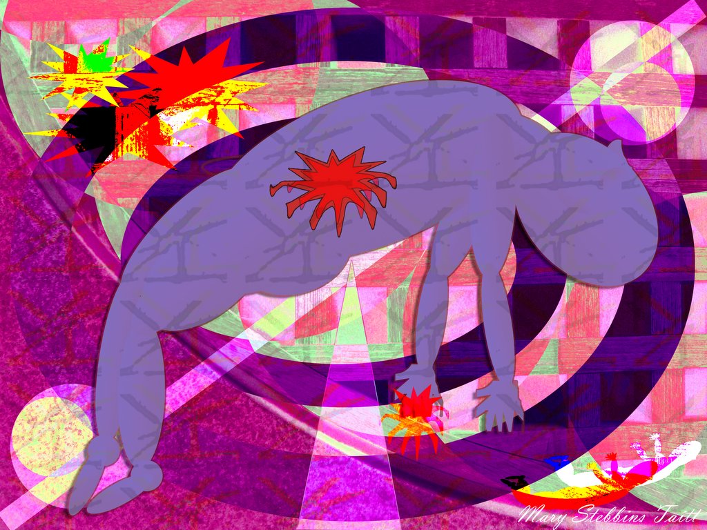
Hung in the Balance, Collateral Damage VN

Hung in the Balance, Collateral Damage VN, by Mary Stebbins, Tait.

If prayers help and poetry helps and art helps and even war supposedly helps, then why do we till have war?

And why innocent people?

This is a submission for complexity, and before judging it too hastily for busy-ness, please consider that it is 42 X 35 inches in its full size.

I realize it IS busy, but all the elements in it seemed important to its message. SO what I want to know, is, IS it too busy for it's full size? Is it too busy for its online size?

I'm upset by the killing of so many innocent people. And I feel helpless. I don't know if art helps in any way. I hope it does. Posted by Picasa

Liquid Simplicity by Joe Terni

100% water with added salt. How simple is that?

Joe's Great Simplicty Shot!!!

Moonlight Simplicity


I like the way this is split down the middle with the line of trees to separate the crop from the sky. I like the simple sky which shows up the moon to full advantage. Without the line of trees and the moon I think this would be very stark and uninteresting.

Friday, July 14, 2006

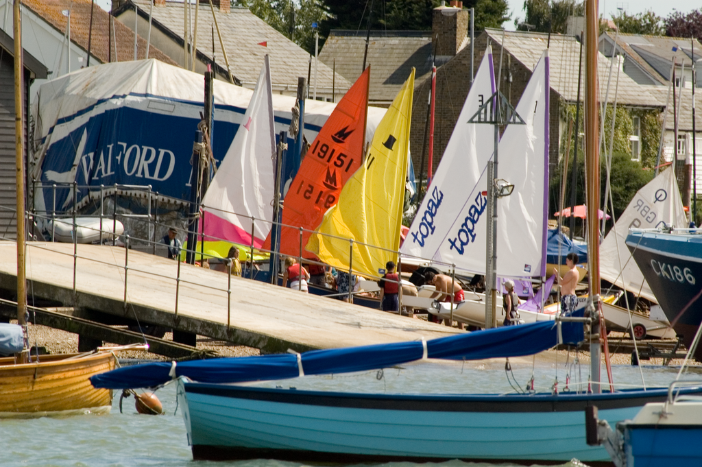
Nautical Complexity - Outtake


I find it much harder to take a decent complexity shot. But after looking for triangles for Photique I liked the repetition of triangles not only in the sails but the boom and hull in the forgeround make a triangle and a sort of triangle in the middle with the slipway to the lifeboat station.

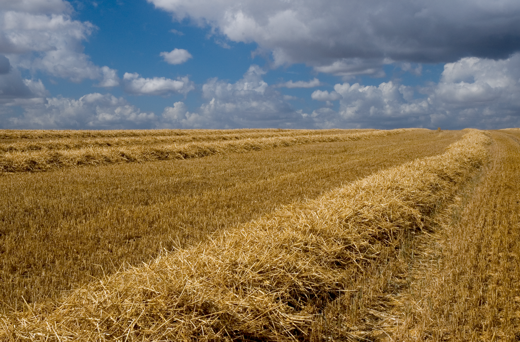
Pastoral Simplicity - Outtake


The reason I took this was because of the sky. But for simplicity's sake I tried it with a plain sky. It was so bad I will not even bother to show you.

Nautical Simplicity - Outtake


I think the simplicity of this image would be improved without all the detail of the buildings on the shore.
Possibly I should clone or layer in something more simple.

Saturday, July 01, 2006

Mr. Key Challenge Photos

Please post your Mr. Key Photos to July 1, 2006 no matter when you took them. Then, they will all be together. Add notes. The date change dialogue is on the bottom left in the tan bar of the posting box under post and comment options. Thank you! :-)

A Journal History of Mr Key by Marsha Smith

Mary, Your Mr. Key blog is very interesting and easy for folks to see everything. I just wanted to let you know exactly how this came about. Somehow it has gotten lost in the shuffle that this started with me and that when it is all over I want Mr. Key back. You are welcome to use both of my Mr. Key shots and the history of how his journey started if you like.

KK Parker posted a photo of a whole bunch of keys. All hotel keys but one. She asked which was different and I just happened to be the first person who saw the odd key.
She congratulated me and told me I had won the key of my choice from the photo. I chose the key with the S since my last name is Smith. I was really surprised when she actually sent it to me. I then made up a "postcard" from 'Mr. Key' to KK saying he was enjoying Texas. This is the link for that shot.

When she saw this, Terry Ellis said how cool if he could visit everywhere. So I sent him to her in California. She posted her shot and then sent him to Bobbie Davis. Bobbie was really busy at the time and didn't post for a long time. I got worried and posted this shot.

Then Bobbie posted her shot and sent him on to you. So at this point that is all the images there are. I am really pleased with everything and hope the momentum keeps up. Kate Jackson is a great place for him to go next and she says she is sending him to 'the flaming pair' in Georgia. I am keeping a journal of his travels and would also like permission from all who host him to use the images in the journal. When he has made the whole trip and gone as far as he can I would like to send the journal and Mr. Key back to KK Parker.

Marsha Smith

Mr. Key Visits Texas by Marsha Smith.


Mr. Key Visits Texas by Marsha Smith. Click image to view larger. Visit Marsha's BP Gallery. Posted by Picasa

MISSING, Mr. Key Missing Poster by Marsha Smith


MISSING, Mr. Key Missing Poster by Marsha Smith. Click on Image to view larger. Visit Marsha's Gallery.

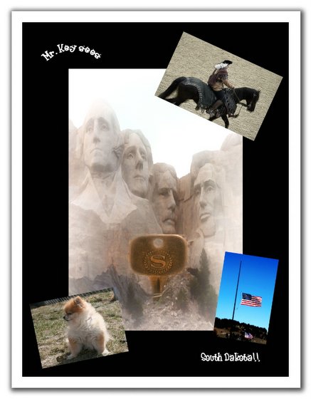
Mr. Key Visits South Dakota, by Bobbie Davis

Mr. Key Visits South Dakota, by Bobbie Davis. Click Image to Vew Larger. Bobbie Davis' Gallery at BetterPhoto.com.Posted by Picasa